COLOUR
What, when and how much
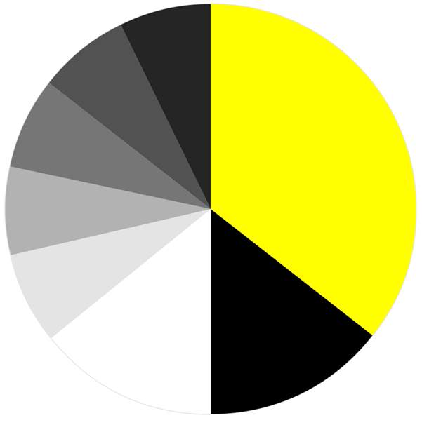
How much yellow?
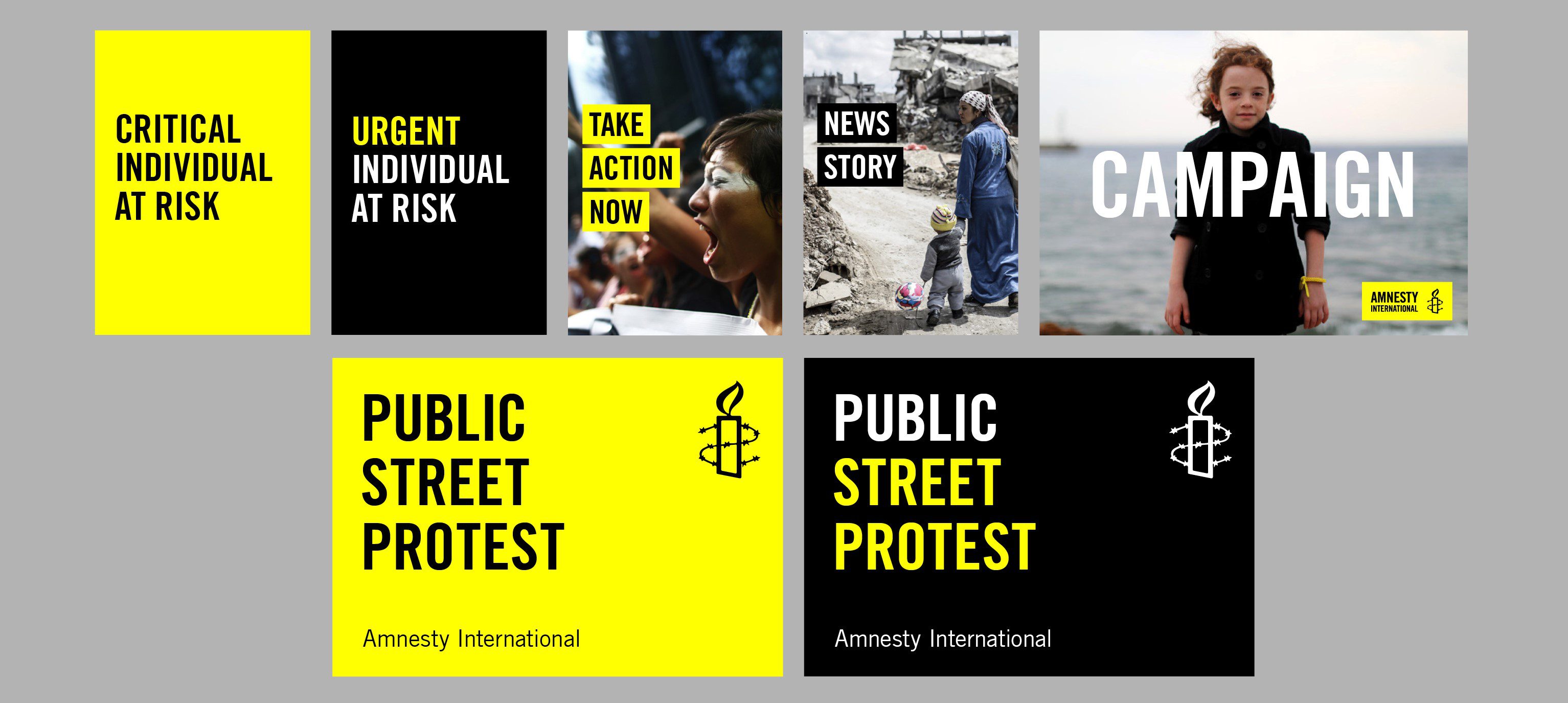
Yellow is our primary colour and symbolizes intervention. We use it like an alert to highlight a level of urgency. Simply, the more the yellow, the more urgent the ask. There are a variety of ways to employ the yellow as the examples show. We use it to give emphasis or special importance to a particular word or to draw special attention to a piece of communication. Considered use of the yellow can help to make a message more visually prominent and to accentuate key words/sentences. Yellow can also be used as a detail of colour in an image.
Secondary colours
Black is the main secondary colour to yellow. It is designed to add strong contrast helping yellow to really stand out and also when black is the only option.
There is a set of secondary greys which should be used sparingly so not to compete with Amnesty Yellow – for example in information graphics and references in reports.
Opposites attract
White plays a vital role in the colour palette too and in many ways is as equally important as black. Sometimes there is a need for a lighter, brighter and more open look to a communication. We use white as the dominant background colour in reports, campaign digests, and also for headlines and copy over still and video imagery.
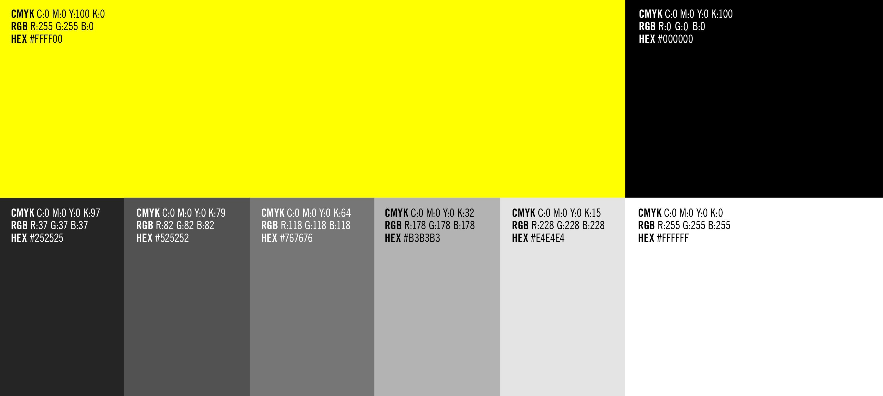
We have created some Amnesty colour swatches in CMYK, RGB and HEX colours, which can be added to your default swatches in Photoshop, Illustrator and InDesign.