Introduction
This visual identity guide is a practical tool for maintaining a strong and consistent brand identity, helping people recognize and connect with us. The guide shows how to use key elements of our visual brand – colours, typefaces, logo – correctly.
Design strategy
We actively seek fresh ideas, diverse perspectives, and meaningful collaborations through an inclusive design approach. Contributions from colleagues, supporters and allies are thoughtfully incorporated. Creative assets should be accessible to all, inspiring trust and genuine connections with our audience. Our global diversity requires careful localization while presenting a unified identity, preserving cohesion and consistency with the brand.
Vision
We have a vision of a world where everyone can enjoy the human rights enshrined in the Universal Declaration of Human Rights and other international human rights mechanisms.
Mission
Our mission is to undertake research and action focused on preventing and ending grave abuses of human rights.
Values
Our core values are rooted in our commitment to the global community of people who want to defend human rights:
- International solidarity
- Action for individuals
- Global reach
- Universality and indivisibility of human rights
- Impartiality and independence
- Mutual and democratic respect
Tone
- Personal
- Dynamic
- Bold
- Innovative
- Empathetic
- Inspiring
- Authentic
History
Amnesty International was founded in 1961, originally focusing on prisoners of conscience, with the remit widening in the 1970s to include miscarriages of justice and torture. Now our research and campaigning covers a broad spectrum of human rights issues with more than ten million members and supporters around the world.
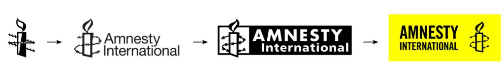
The Amnesty Candle was designed by Diana Redhouse and was inspired by the Chinese proverb, ‘Better to light a candle than curse the darkness’.
Logo
The consistent and intentional use of our logo means it can go beyond being a recognizable symbol and become an emblem of inspiration for people who share our vision of creating a better world. Rooted in our legacy of quality research and bold campaigning, it symbolizes the collective strength of our organization to challenge the status quo and propel us toward a more just and compassionate world. By incorporating our logo consistently, we reinforce not only the trust we have earned but also the belief that, united, we can make a tangible impact.
Full logo
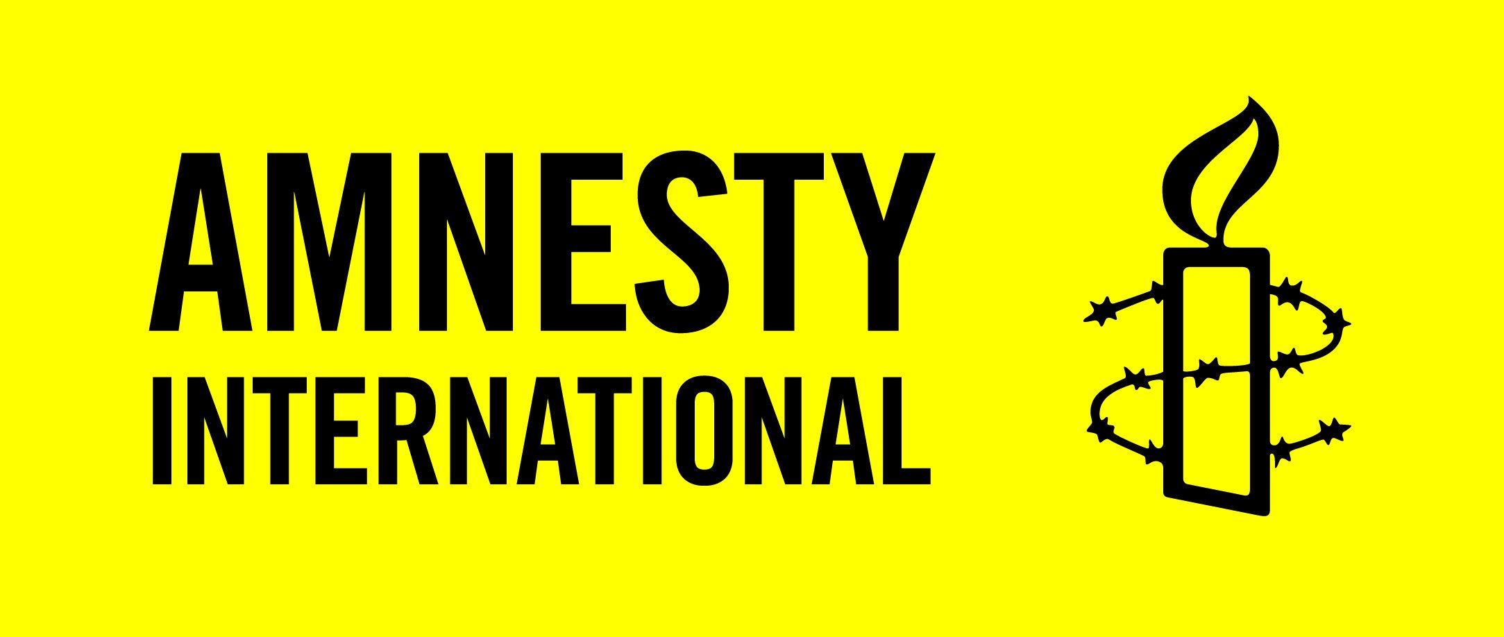
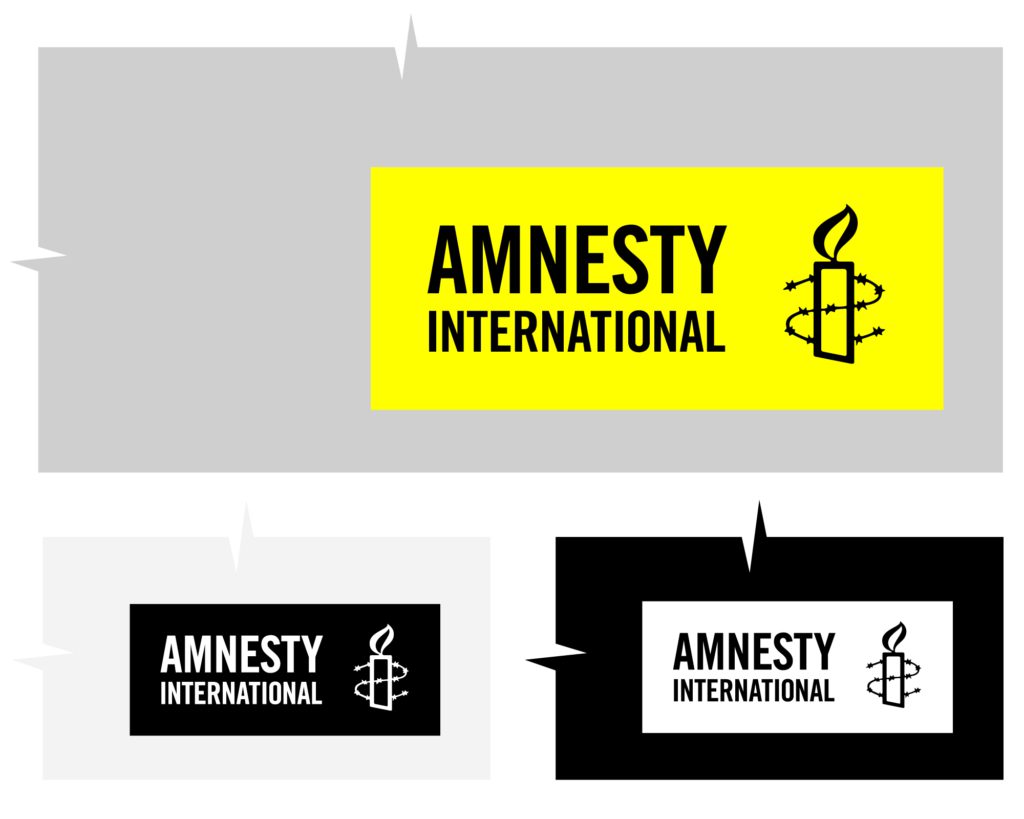
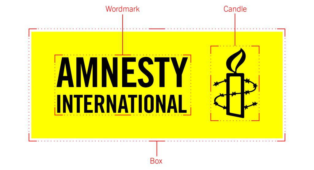
Black on Yellow is our preferred logo and should be used wherever possible. The logo consists of three elements; wordmark, the candle symbol itself, and the box.
The box around the logo is a crucial design element, containing the word mark and candle. This enclosure ensures a unified presentation, visually locking these elements together in a cohesive, memorable and impactful logo.
You can download our logos below. Please ensure that these are used in accordance with our terms of use.
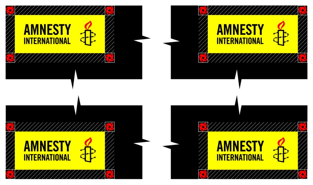
Spacing, size and positioning
The logo clear space is the area around the logo that must be kept free of other graphic elements such as typography or busy elements of the image. The height of the ‘flame’ in the candle symbol is used to define the logo clear space area.
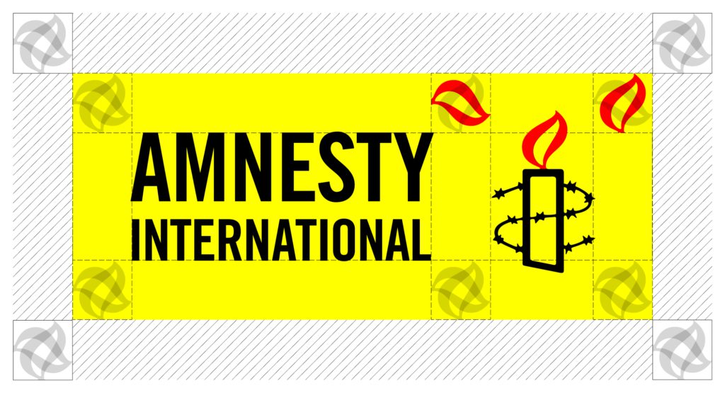
The logo should act as a signature and not compete in size with any message on the same page. The logo should always be less than half the size of the main message in the content but always stay legible.
The minimum gap between the logo and design edges must be at least the candle flame’s size.
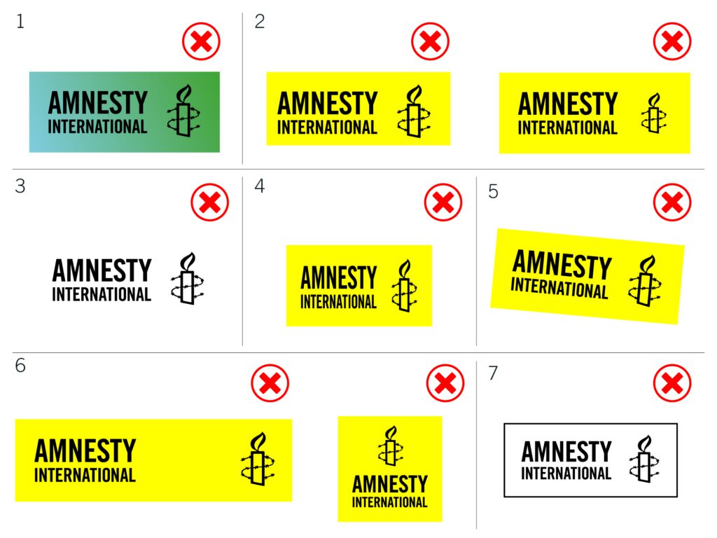
- Don’t change the logo colours
- Don’t change the size or positioning of any of the logo elements
- Don’t remove the box
- Don’t change the proportions of the logo
- Don’t rotate the logo
- Don’t change the spacing and positioning of the elements in the logo
- Don’t outline the box around or create transparencies in the logo
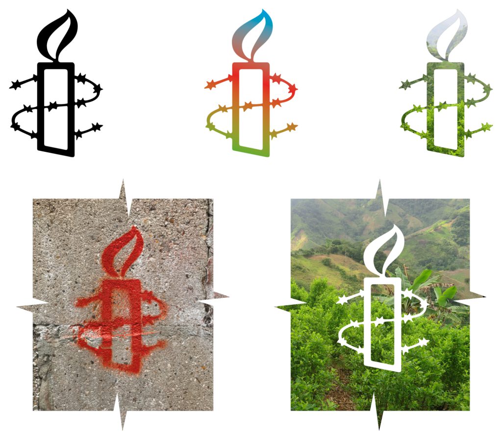
Candle
The candle element can be used separately from the full logo, but it should be seamlessly integrated into the layout from the outset, not added as an afterthought. While the candle’s shape should remain the same, there are many creative ways to incorporate it.
Co-branding
Specific guidelines for co-branding arrangements are determined through collaborative agreements with partner organizations. The extent to which each entity’s visual style is incorporated is approached on a case-by-case basis, allowing for nuanced decisions tailored to the nature of the collaboration. When utilizing the Amnesty logo in co-branded materials, adherence to our standard safe space rules is imperative, ensuring the logo remains unchanged and visually impactful within the established guidelines.
Brand hijacking
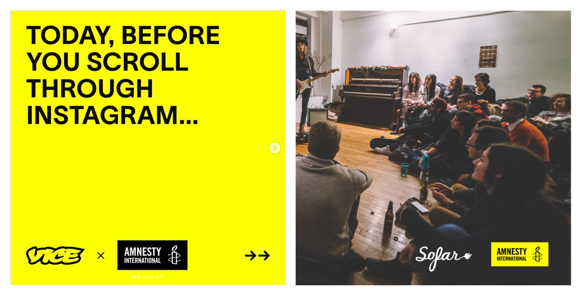
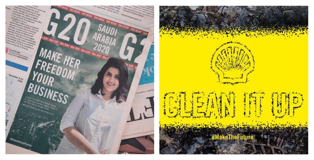
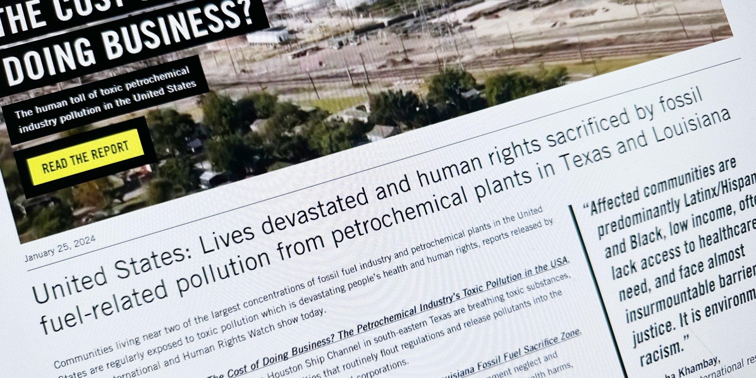
We strategically employ visual shifts as a critical tool for brand attacks*. This involves temporarily adopting alternative styles to parody other organizations, drawing attention to problematic aspects of their business practices. This tactical visual transformation allows for a powerful and attention-grabbing critique, providing a unique avenue to engage with the audience in a thought-provoking manner. While adopting a different visual approach, to ensure transparency it is crucial to make clear that it is still Amnesty’s work.
*note that it is important to get a legal check before using parodied logos as part of a brand attack
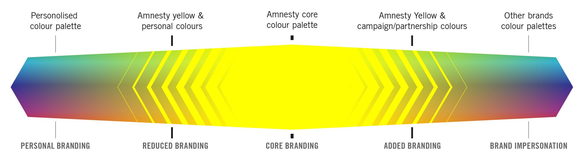
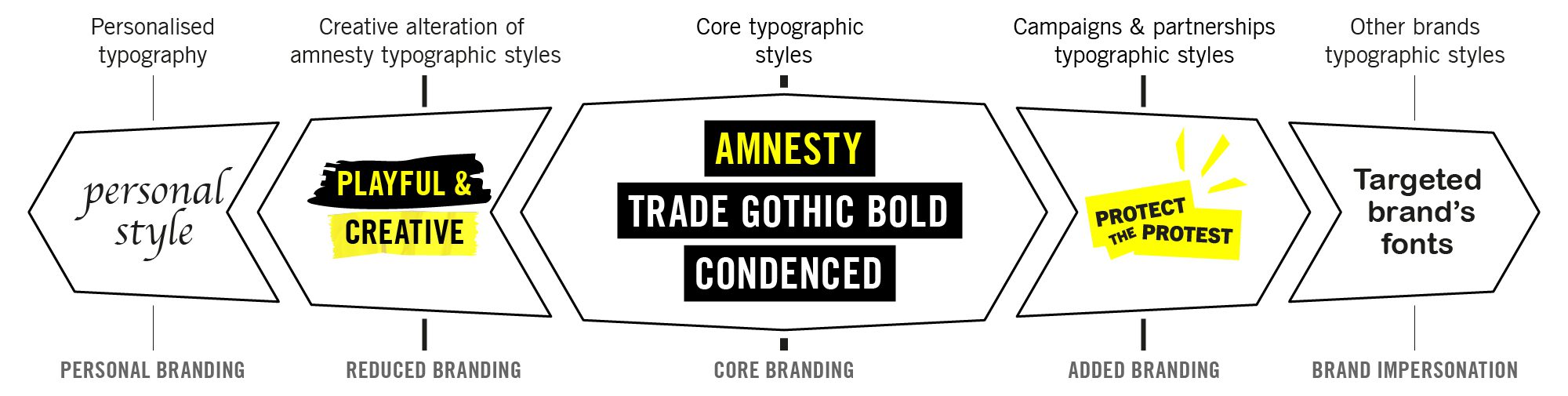
Logo sliding scale
The scale below represents how we use our logo depending on context. At the centre is our ‘core branding.’ Here, we strictly adhere to Amnesty visual guidelines using the full logo.
Moving left, we progressively lose branding elements and can use the candle instead of the full logo. At the extreme left, we embrace a more personal visual language, allowing for individual expression with no logo, for example for when we are working with grassroots activists.
Moving right, branding becomes more targeted as we add other branding elements. Specific campaigns may feature unique logos, and partners’ visual styles could be incorporated. The far end leads to complete style camouflage, for example, for brand attacks.
To help build brand recognition the full logo should always be used with official outputs and when possible, with content designed to be shared with new audiences who may not know the organization.
/
Colours
Our core brand colours, primarily yellow, black and white, are a distinct element of our visual identity. Consistent use of these colours is crucial for establishing a strong, cohesive and recognizable brand identity across communications.
However, this doesn’t mean designs must be confined to yellow, black, and white. We encourage the use of other colours in illustrations and photographs to add vibrancy and diversity to our visual materials. There’s no predefined secondary colour palette; you have the freedom to choose colours that suit the context and enhance the impact of an output. Let your creativity flow while ensuring our core colours remain a consistent element.
Core palette
We have created some Amnesty colour swatches in CMYK and RGB, which can be added to your default swatches in Photoshop, Illustrator and InDesign.

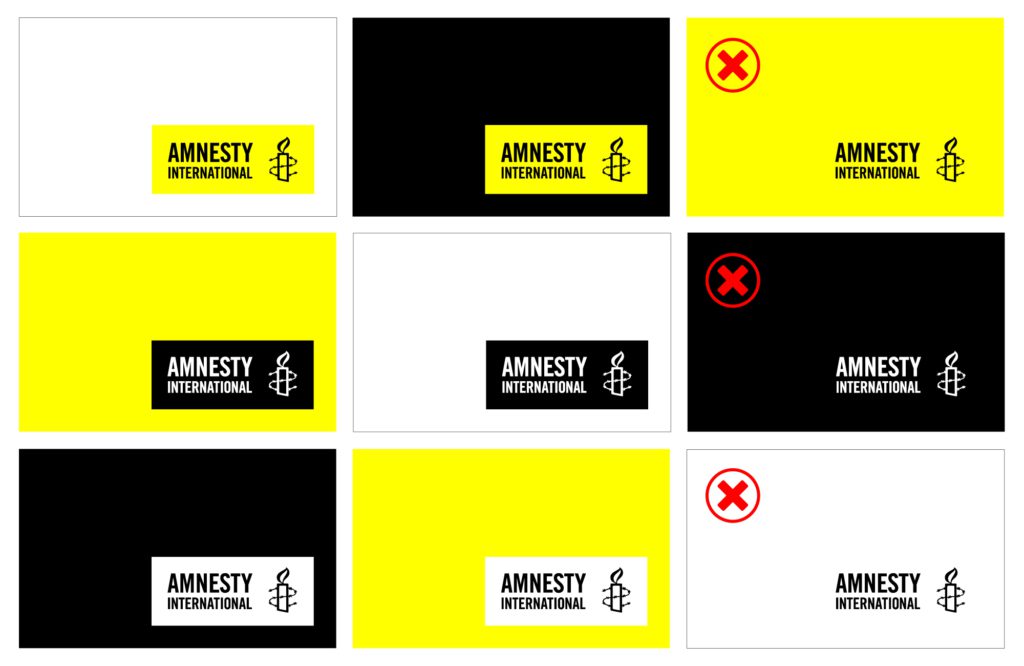
Choosing the correct logo colour
Choose the logo option that allows for the best contrast with the background of your content.
Additional colours
For shades of grey, we recommend using any neutral greys where R=B=G in RGB. For a neutral grey tone in CMYK, set cyan, magenta, and yellow to zero, adjusting only the black channel as needed.
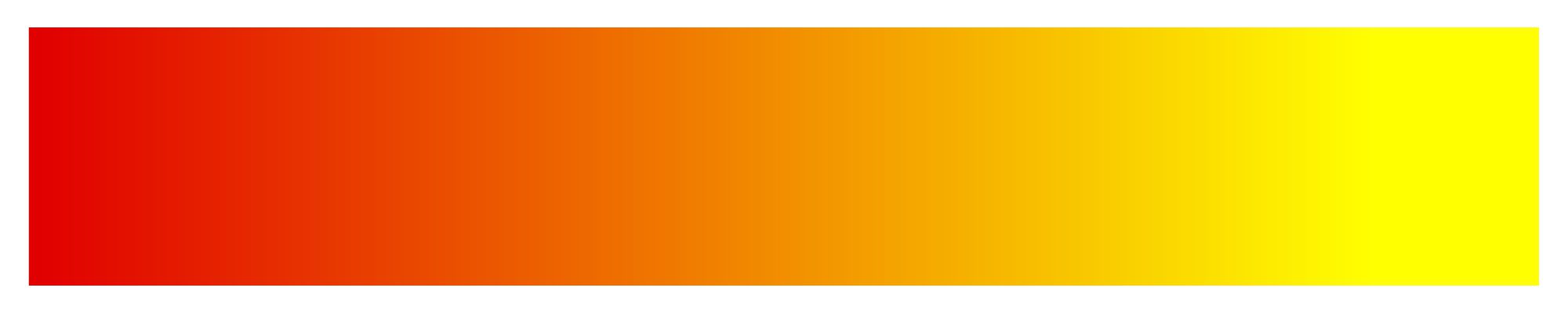
In case additional colours are needed for graphics and charts, we recommend using colours ranging from yellow to orange to red, reflecting the colours of a flame.

Opacity
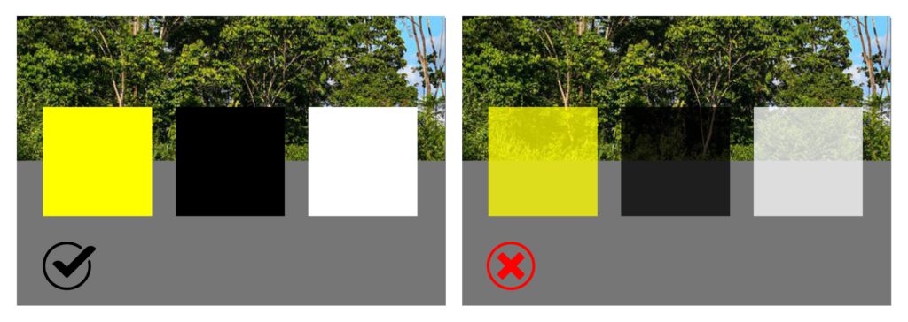
In our colour palette, we adhere to the principle of using fully opaque colours. This decision aligns with our commitment to clear, honest messaging.
Campaign colours
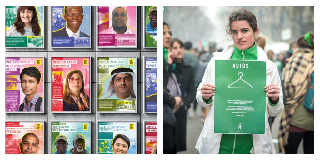
For global campaigns such as Write for Rights, each of the 10 cases may have a different colour.
Thematic work, like abortion rights, may use colours associated with the relevant human rights issue. However, the core brand colours should still be present, and the logo colour should remain unchanged.
Amnesty colour sliding scale
This colour scale helps to adapt our visual identity within various contexts and communication goals. At the core, Amnesty’s iconic yellow conveys the reputational power of the organization and should be used in strict adherence to brand along with black and white.
Moving away from the centre other colours can be introduced strategically when less brand recognition is required. At this stage, it’s essential to maintain the presence of the Amnesty core palette, though outputs are not exclusively limited to it. At either end the brand colours may be completely omitted when the amplification of individuals or communities is the priority or when using another brand identity for creative purposes.
/
Typefaces and typography
Our typographic styles convey distinct voices therefore maintaining consistency is crucial. Wherever possible they should be used in all our communications, video, web, or print, to build our brand and help unify the movement.
Global Scripts
So that we can all enjoy our human rights, we work in an expanding range of languages and aim to bring our messages to as many people as possible in the languages that work best for them.
The recommended typefaces for languages using other scripts or writing systems is as follows.
| LANGUAGE | PREFERRED FONT |
|---|---|
| Arabic | Expo / Dubai |
| Burmese | Pyidaungsu |
| Chinese | Noto Sans SC / Noto Sans TC |
| Georgian | Sylfaen |
| Greek | Myriad Pro |
| Hebrew | Noto Sans Hebrew |
| Hindi | Mangal |
| Japanese, Korean | Noto CJK jp-hinted |
| Nepali | Preeti |
| Pashto | Tahoma |
| Persian | Dari Nazanin |
| Sinhala | FM Abhaya |
| Tamil | Lathab |
| Thai | Anuphan / Noto Sans Thai |
| Urdu | Gulzar |
| Vietnamese | Source Sans Pro |
Latin-script languages
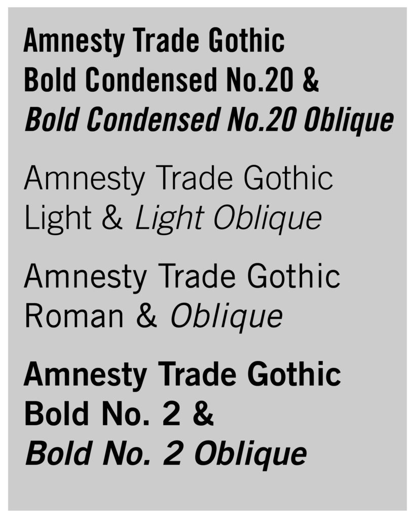
The brand typeface for languages using the Latin script is Amnesty Trade Gothic. These include English, French and Spanish, as well as languages including Azerbaijani (when written in Latin script), Hausa, Hungarian, Indonesian, Latvian Malay, Montenegrin, Polish and Turkish and many more.
If you are working for Amnesty International you have permission to use our typeface. Download Amnesty Trade Gothic.
If you are contracted by Amnesty International please get in touch with your contact and ask them to download it for you.
If you are a student or working on a self-initiated project please use a similar free font Roboto or any other version of Trade Gothic.
The brand typeface for Cyrillic-script languages is Roboto. These include Azerbaijani (when written in the Cyrillic script), Macedonian, Russian, Ukrainian and Uzbek. Download our guide for additional advice. [add link]
Note that much of the guidance for Latin-script typography using the Amnesty Trade Gothic typeface is also applicable to Cyrillic-script typography using the Roboto typeface.
Hierarchy
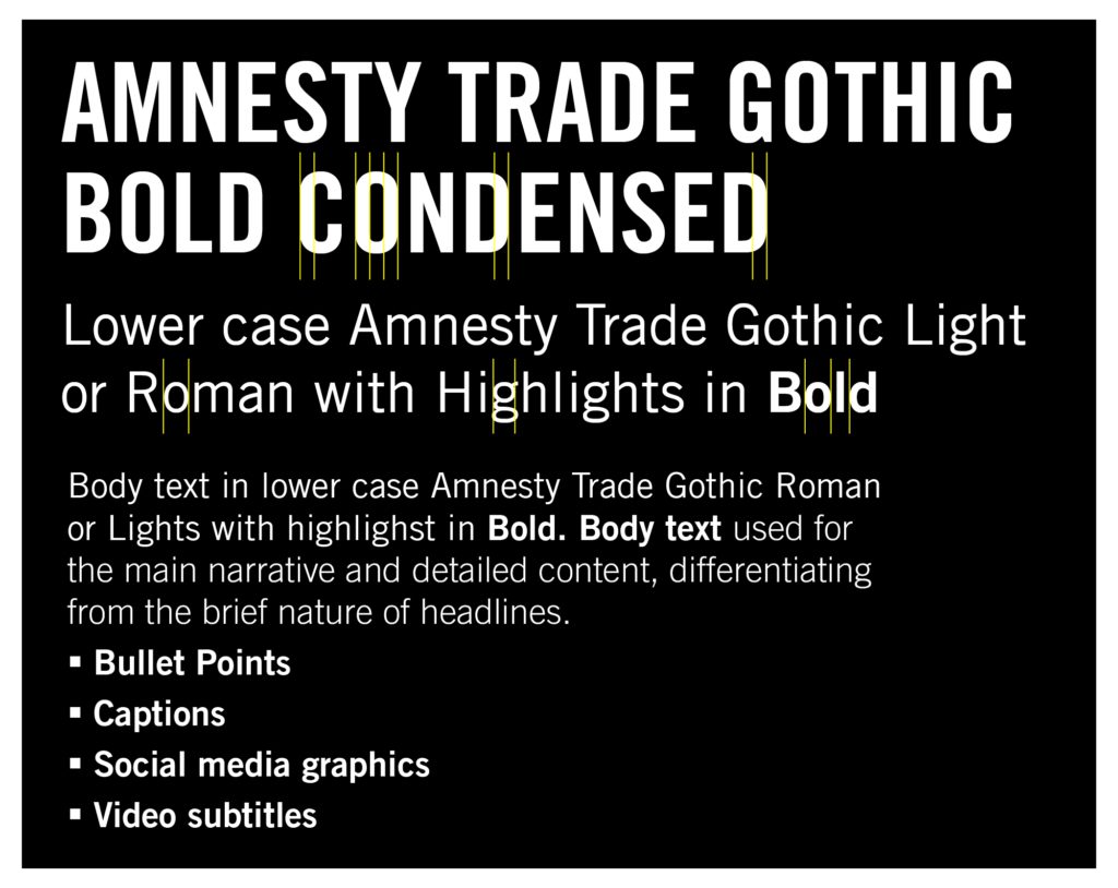
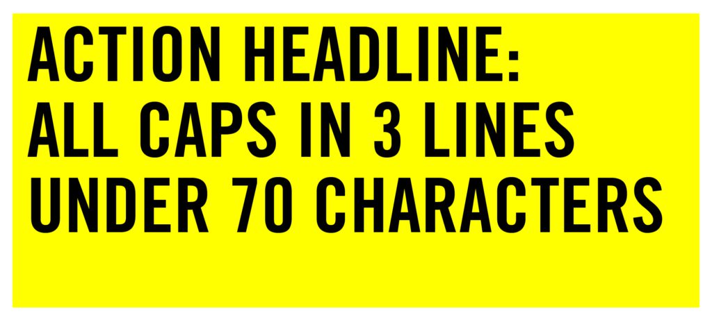
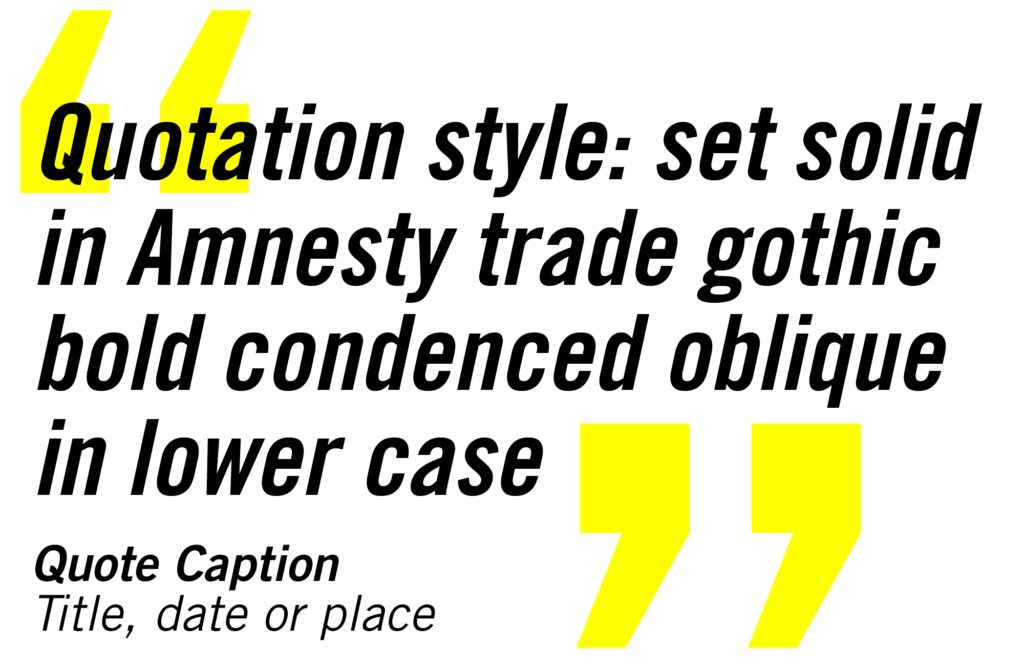
The action headline font is Amnesty Trade Gothic Bold Condensed in all-caps. This ensures a bold and attention-grabbing presentation. Straight vertical lines within curved letters, such as O, D, G, and C, impart strength and assurance to headlines with a bold and assertive visual impact. Use Amnesty Trade Gothic Bold Condensed Oblique lowercase for quotations.
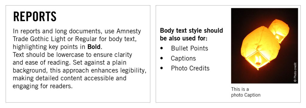
For narrative writing purposes use the text font, Amnesty Trade Gothic Light, Roman, and Bold. These differ from our condensed action headline font, with curved lines in letters like o, c, d, and e.
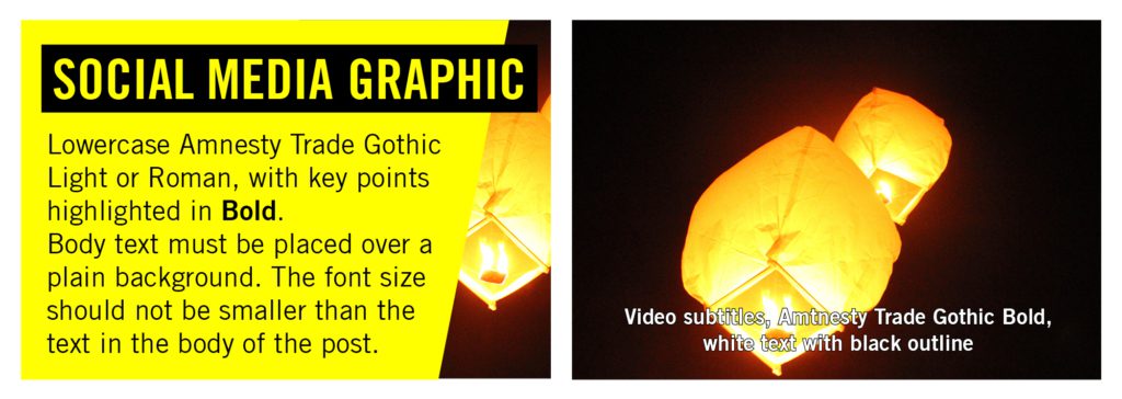
These fonts ensure legibility and are more effective for longer text uses, from lengthy reports to social media graphics.
Action headlines
Action headline style
Action headlines should be typeset in Amnesty Trade Gothic Bold Condensed in all caps. Good action headlines should be under 70 characters and limited to three line. If your text is longer than this then it’s not an action headline and an editorial headline style should be used. (see editorial headlines).
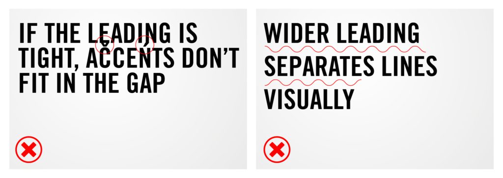
Action headline leading
Set plain background headlines “solid,” where the font point size equals the leading (space between lines).
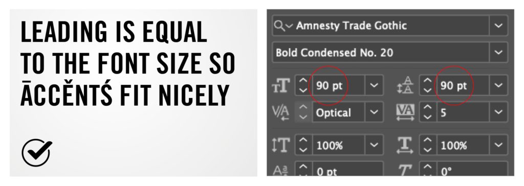
Adjusting the leading may cause accents in different languages to overlap with other lines, and widening it may result in disconnected lines.
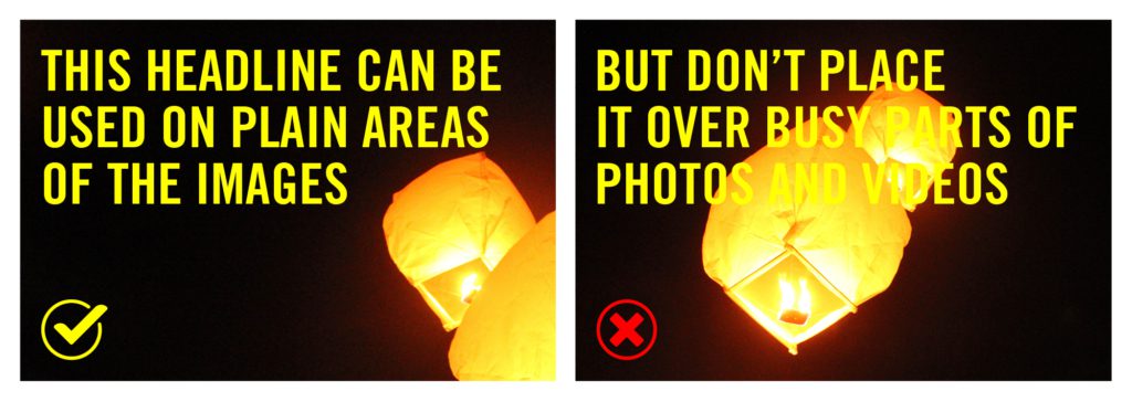
Action headlines must be placed on solid backgrounds or non-contrasting, plain areas of images or videos for clear readability. Avoid positioning them over busy image sections.
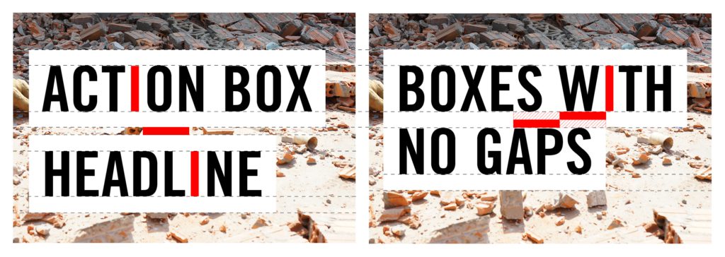
Action headline box
Box highlighting significantly boosts text visibility, especially when overlaid on images. However, it is crucial to apply this style judiciously and refrain from unnecessary use when text is not superimposed on an image or other unsolid background.
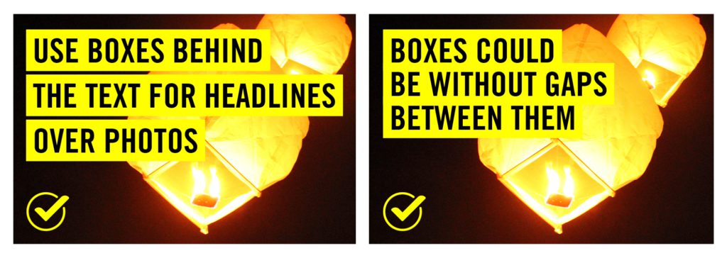
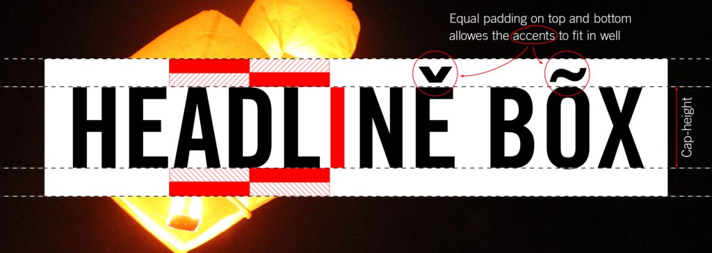
Action headline box spacing
The spacing above and below the letters should be equal to width of the capital letter ‘i’ multiplied by two. This ensures that the accents above and below the letters fit within the highlighted space.
Action headline box leading
The spacing between box-highlighted lines can differ, with the maximum gap being the width of the letter ‘i’.
The smallest leading should be not smaller than the font size to ensure accents fit and the box does not overlap the next line’s text.
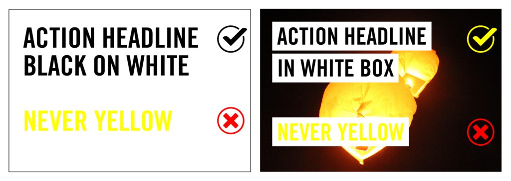
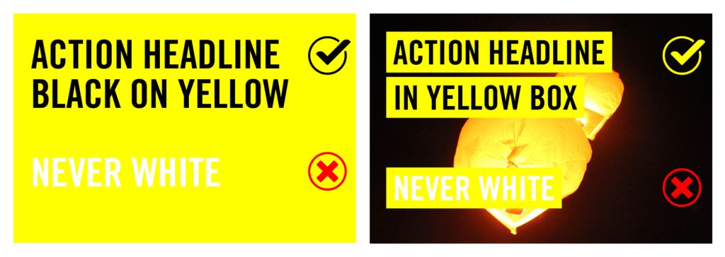
Headlines colours
On dark backgrounds, strategic use of yellow can highlight specific words, drawing attention. However, highlighting large text areas can diminish the emphasis. Ideally, only one or a few key words should be highlighted, not exceeding one-third of the text.
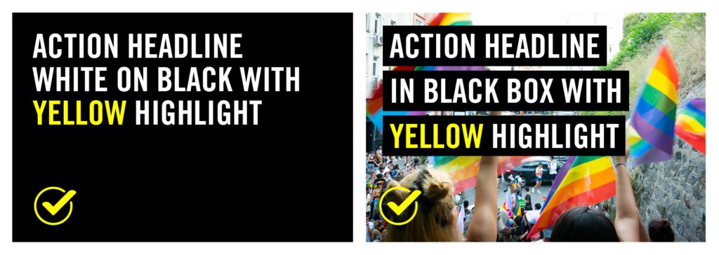
On light backgrounds, maintain text colour in black to ensure contrast. Use this tool for checking text accessibility and contrast levels.
Using action headlines
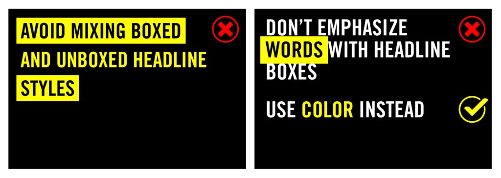
Headline styles with and without boxes should not be mixed, as they create uneven spacing between lines. It’s best to consistently use one headline style, with or without the box, throughout the document.
The box should not be used to emphasize specific words.
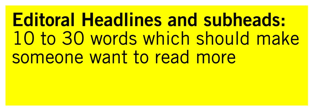
Editorial headline / Subheading
When a headline is too long to be an ‘action headline’ use lowercase non condensed Amnesty Trade Gothic Roman or Light with highlights in Bold.
Body text
Narrative text should be typeset in lowercase Amnesty Trade Gothic Light or Roman with key points highlighted in Bold.
Quote style
Use Amnesty Trade Gothic Condensed Oblique lowercase for quotation text. We also recommend using ‘curly’ quotation marks for a more refined and professional typographic appearance, as opposed to straight quotation marks. Link to keyboard shortcuts for quotation marks here.
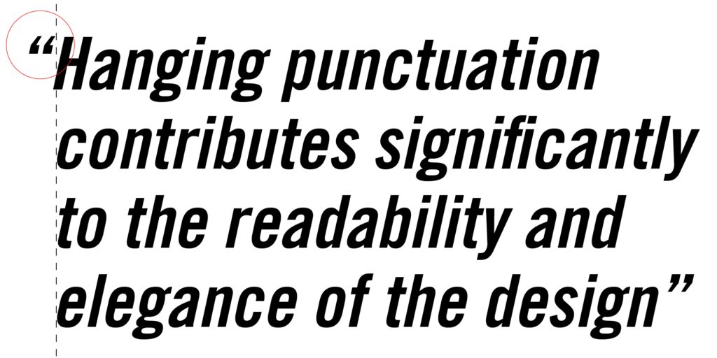
Hanging punctuation is a typographic technique that involves adjusting certain punctuation marks, such as quotation marks, hyphens, or dashes, to extend slightly outside the regular text alignment, creating a visually refined and balanced text block.
Typography visual identity scale
This scale ensures our typographic identity is flexible for different contexts and partnerships. At the centre is our core brand, strictly following our typographic style with bold action headlines.
Moving left, the typography can become more playful, and we can introduce other creative alterations. At this polarity, we may completely forgo our core fonts for a more personal typographic style.
Moving right, we might add typographic styles relevant to specific campaigns and collaborations, and at the far right other styles can entirely replace our typographic identity for brand hijacks.
Inclusive design approach
Inclusive visual communication helps us fight injustice and inequality. Amnesty’s diverse network regularly engages millions of people, requiring us to responsibly promote equity, celebrate diversity, and amplify voices which have historically been excluded. This may require using minimal or no branding and taking extra care when creating content, especially for fundraising. We must have awareness of the limits of our experiences and perspectives in relation to what an image can mean/represent to others, show diversity without propagating racial or cultural stereotypes and actively challenge and interrogate our decision making. Be open to other people’s opinions, and to discussing sensitivities around the content being created. For more information see Using visual content.
Visual identity scale
Our scales for logo, colour, and typography form a three-dimensional system within our visual identity. This integrated approach allows for a comprehensive evaluation of branding levels for each project.
In this system, each project can be uniquely positioned based on its specific branding requirements. Adjustments along one axis, such as the logo, can be made independently of the others, like colour and typography. This offers the flexibility to emphasize or minimize certain branding elements depending on the context of the project.
The three axes interact, enabling a multifaceted approach. This method ensures that every campaign or project can express its individuality while still aligning with the overall visual brand identity.

/
Design elements
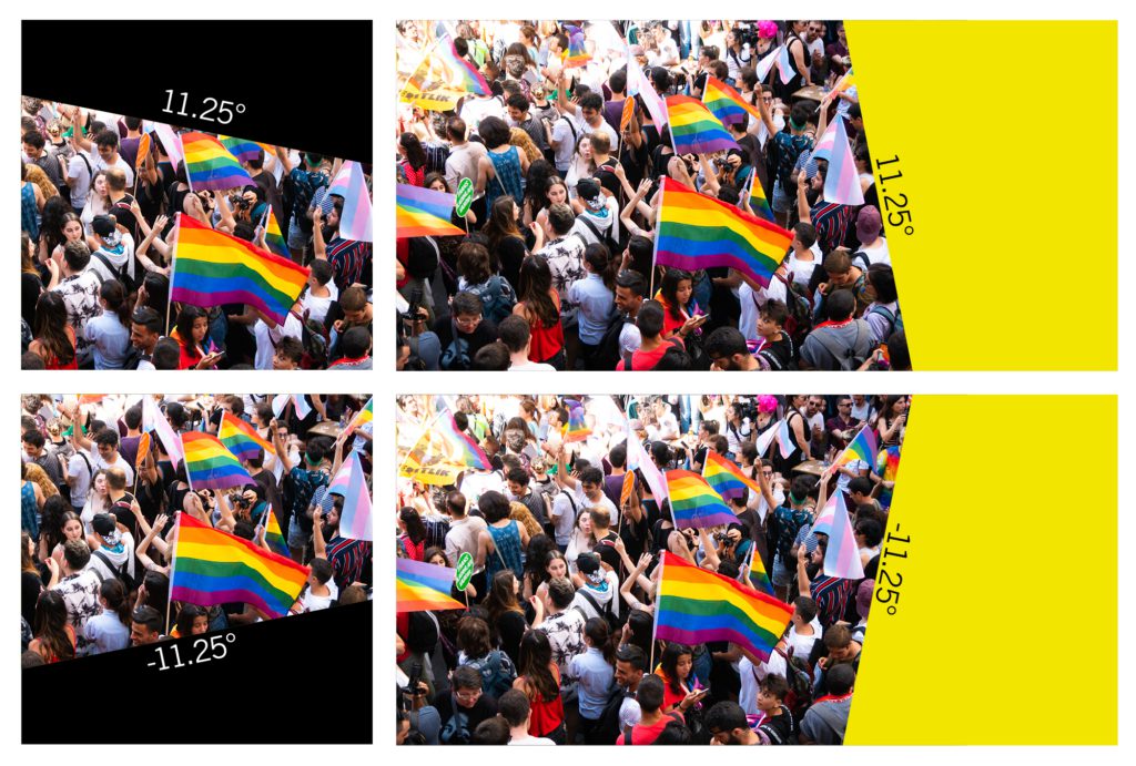
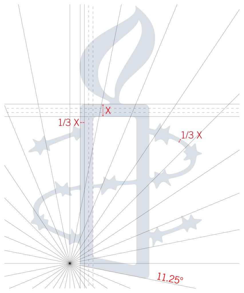
11.25°
Since its inception in 1963, our iconic candle has featured a distinctive dynamic cut at the bottom. This characteristic of our visual identity can be integrated in various ways by consistently applying the 11.25° angle to different design components.
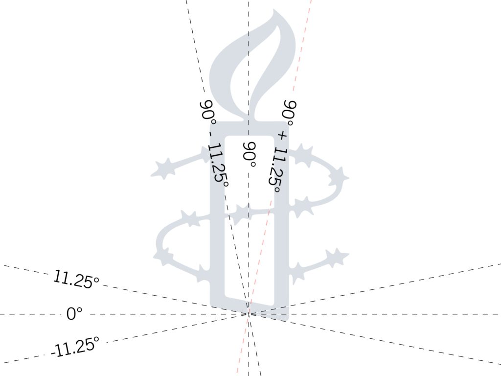
Using the 11.25° angle along either the horizontal or vertical axes can create framing devices for our content. These shapes serve versatile purposes, whether framing photos, facilitating transitions in footage, or acting as separation devices.
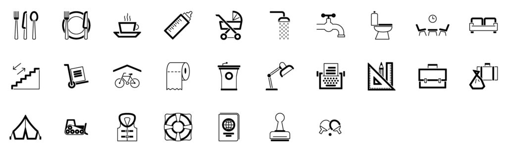
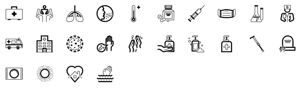
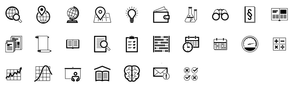
Iconography
Our icons draw inspiration from the design of our candle and use two lines—one three times thicker than the other. Round corner radius equivalent to the thickness of the thinner line. The use of an 11.25° step ensures consistent angles, aligning with the iconic bottom cut of the Amnesty candle. Common angles like 45 and 90 degrees fall within this step range.
Maintaining consistent icon sizes ensures that the lines in all icons remain uniform in thickness, contributing to a visually cohesive and polished appearance.
While striving for simplicity, some complex issues may not be fully represented by a single icon. Icons are designed to work in harmony with accompanying text, serving as visual aids that, when combined with headlines, offer a comprehensive representation of the intended message.


Terms of use
The “Amnesty International” words and the Amnesty candle and barbed wire logo (the “Amnesty Marks”) on this webpage are internationally recognised trademarks belonging to Amnesty International Limited, based in the UK. You may only use the Amnesty Marks on all of the following conditions:
- The Amnesty Marks are used only in accordance with the guidance on this webpage;
- The Amnesty Marks shall be used purely for referential and non-commercial purposes;
- The Amnesty Marks shall be used only for the purpose of onward publication or other dissemination of authorised Amnesty International publications available on this website;
- You do not use the Amnesty Marks in any way that could indicate or create the impression that Amnesty International endorses, approves, sponsors or is affiliated with any products, services or goods available including via your own website and/or social media;
- The Amnesty Marks are not combined with any other graphic elements or altered in any way other than as set out on this webpage;
- The Amnesty Marks do not appear any more prominently than your own logos or company name;
- The Amnesty Marks remain the exclusive property of Amnesty International, and by using the Amnesty Marks, you agree that you shall not, in any way whatsoever, register or attempt to register the Amnesty Marks, or challenge the same;
- You use the Amnesty Marks in the context of our publications in accordance with our Permissions, which are set out here: https://www.amnesty.org/en/about-us/permissions/.